Glengoyne Solstice Series
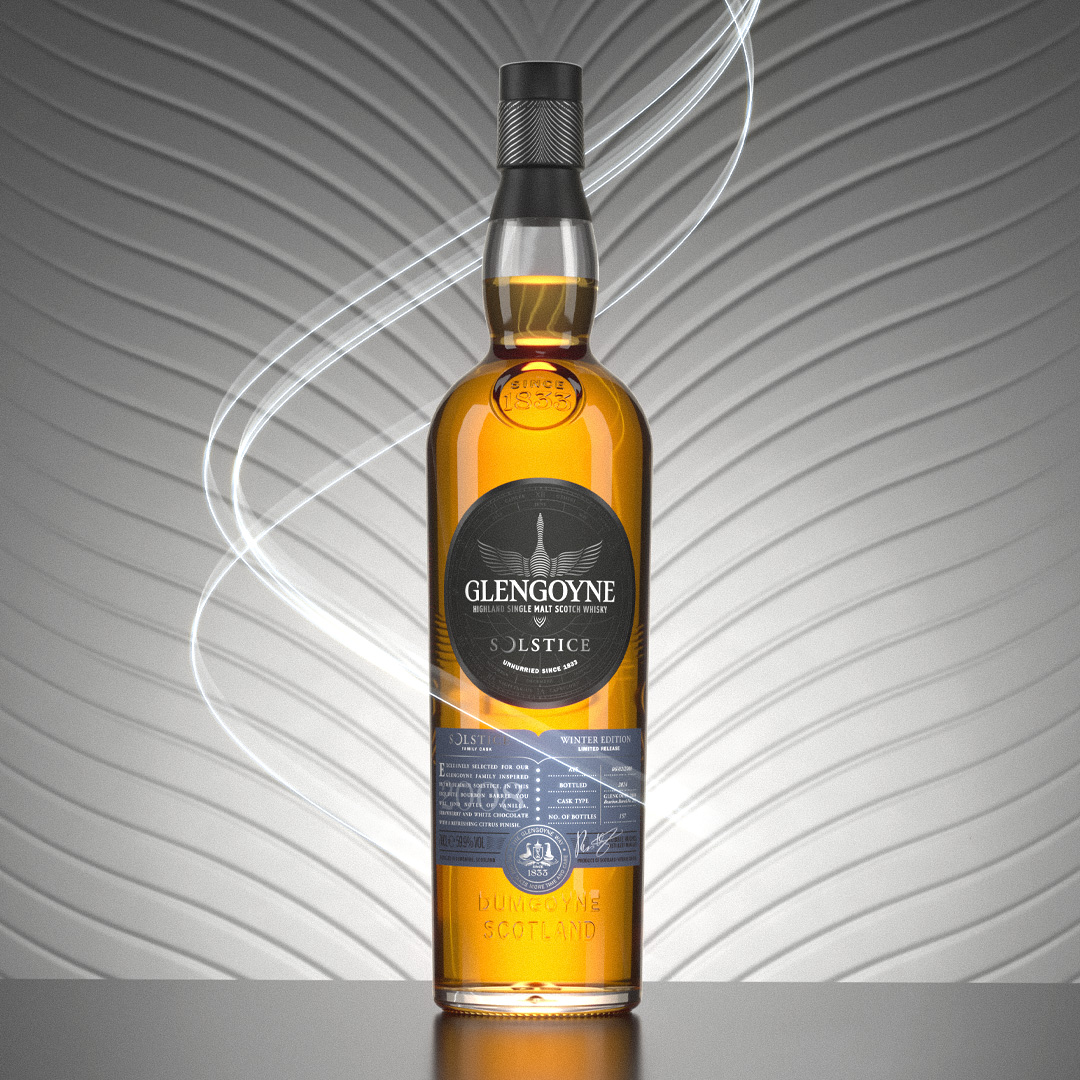
The Glengoyne Solstice Series is a pair of limited edition releases to celebrate the Summer and Winter Solstice.
The releases were inspired by a solography project that Glengoyne conducted at the distillery over a period of 12 months, also highlighting the distillery’s reputation as Scotland’s slowest distilled whisky.
Work created at d8.uk.
Deliverables
Visual identity
Packaging design
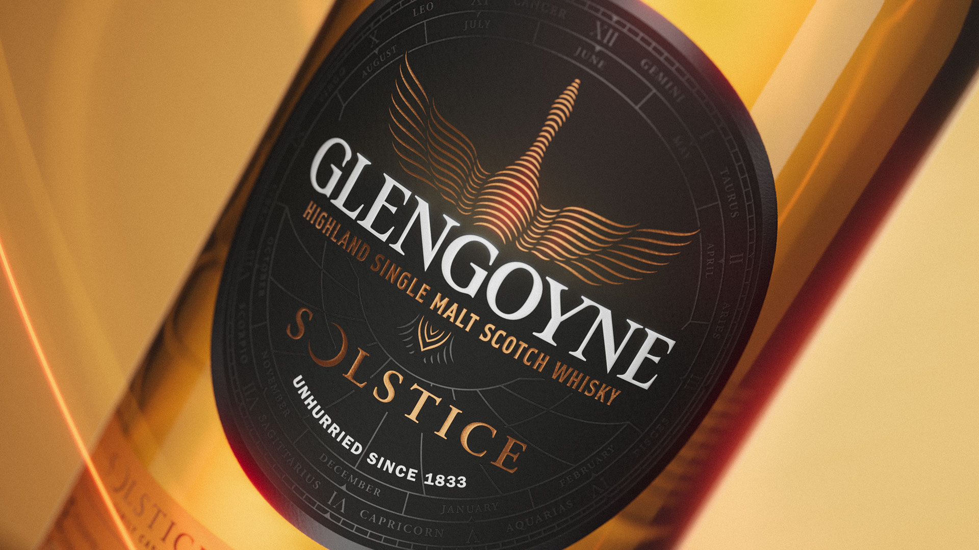
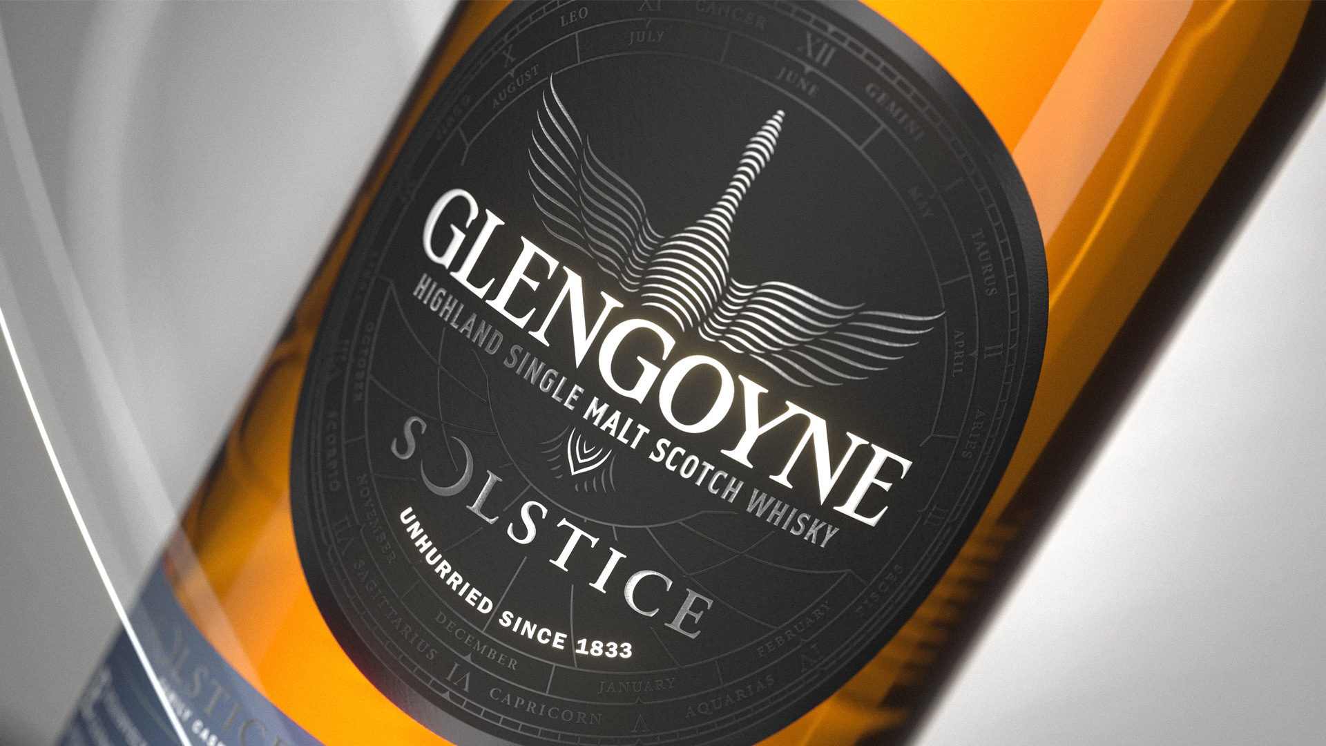
Adapting the Glengoyne clock face
The Glengoyne clock face is a prominent feature across all Glengoyne releases, symbolising the brand’s identity in slow distillation and lengthy maturation. To make these releases truly exclusive, I took inspiration from visual elements in astronomy and constellations to represent the understanding of the passage of time.
By incorporating an “Astrolabe,” an ancient astronomical instrument used for measuring celestial events, I found the perfect element to include in the Glengoyne label design.